
Some of Our Sources
- Technology Review
- Web Designer Wall
- Team Treehouse
- Just Creative
- Pearsonified
- Abduzeedo
- Fuel Your Creativity
- 24 Ways
- Wal You
- Android Dissected
Help Webnuz
Referal links:
March 20, 2017 05:55 am PDT
Original Link: http://feeds.boingboing.net/~r/boingboing/iBag/~3/N6XJ_WXJcIA/interactive-map-of-educational.html
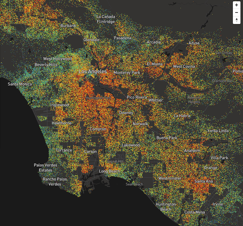
Interactive map of educational attainment in America
Original Link: http://feeds.boingboing.net/~r/boingboing/iBag/~3/N6XJ_WXJcIA/interactive-map-of-educational.html
Share this article:
Tweet

View Full Article
