
An Interest In:
Web News this Week
- April 4, 2024
- April 3, 2024
- April 2, 2024
- April 1, 2024
- March 31, 2024
- March 30, 2024
- March 29, 2024
Some of Our Sources
- BoingBoing
- Mashable
- Technology Review
- The Logo Smith
- Spoon Graphics
- Vandelay Design
- Creative Curio
- My Ink Blog
- Wal You
- The Verge
Help Webnuz
Referal links:
March 13, 2017 08:54 am PDT
Original Link: http://feeds.boingboing.net/~r/boingboing/iBag/~3/4Aql9wVwyQk/minima-a-tiny-4px-typeface-c.html
Minima, a tiny 4px typeface, certain to annoy many
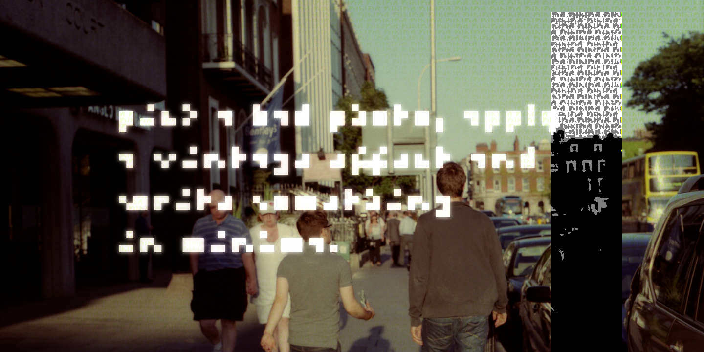
There are typefaces that attempt to remain legible at ludicrously small sizes. Ken Perlin's Tinyfont attempts to do so while retaining traditional letterforms, putting LCD subpixels to clever use. There are various 3x5 pixel fonts for those who prefer the crisp purity of the traditional pixel, and prior attempts at the holy grail of a legible 3x3 nerd font. Minima is an effort to make the perfect 4x4 pixel font, allowing itself a little more space but also going step further toward abstraction, abandoning legibility in favor of more easily-distinguished characters. It's €10 and I need a tylenol.
via Brutalist Websites.
Original Link: http://feeds.boingboing.net/~r/boingboing/iBag/~3/4Aql9wVwyQk/minima-a-tiny-4px-typeface-c.html
Share this article:
Tweet

View Full Article
