
Some of Our Sources
- Techcrunch
- Just Creative
- Joshua Blankenship
- Spoon Graphics
- Six Revisions
- Fuel Your Creativity
- Wal You
- Freelance Switch
- Android Dissected
- Android Headlines
Help Webnuz
Referal links:
March 3, 2017 01:11 pm PST
Original Link: http://feeds.boingboing.net/~r/boingboing/iBag/~3/GlG1D7hzx9k/suggestion-for-improving-the-d.html
Suggestion for improving the design of the Academy Awards cards
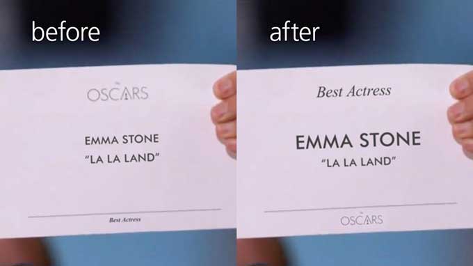
Benjamin Bannister has a good idea about the design of the Academy Awards cards.
Thats horrible typography. I will emphasize horrible again. Horrible. Or to be nicer, not good. Look at it again. Of course, anyone couldve made the same honest error!
The words Best Actress is on thereat the very bottomin small print!
You are on television with millions of people around the world watching. You are a little nervous, and you have to read a card. You will most likely read it from top to bottom (visual hierarchy) without questioning whether the card is right. That look on Warrens face was, This says Emma Stone on it. Faye mustve skipped that part and was caught up in the excitement and just blurted out, La La Land.
Original Link: http://feeds.boingboing.net/~r/boingboing/iBag/~3/GlG1D7hzx9k/suggestion-for-improving-the-d.html
Share this article:
Tweet

View Full Article
