
An Interest In:
Web News this Week
- April 21, 2024
- April 20, 2024
- April 19, 2024
- April 18, 2024
- April 17, 2024
- April 16, 2024
- April 15, 2024
Some of Our Sources
- Engadget
- Techcrunch
- Spoon Graphics
- TutsPlus - Design
- Noupe
- CSS Tricks
- Spyre Studios
- Freelance Switch
- Design Modo
- Android Dissected
Help Webnuz
Referal links:
The Typography of Stranger Things
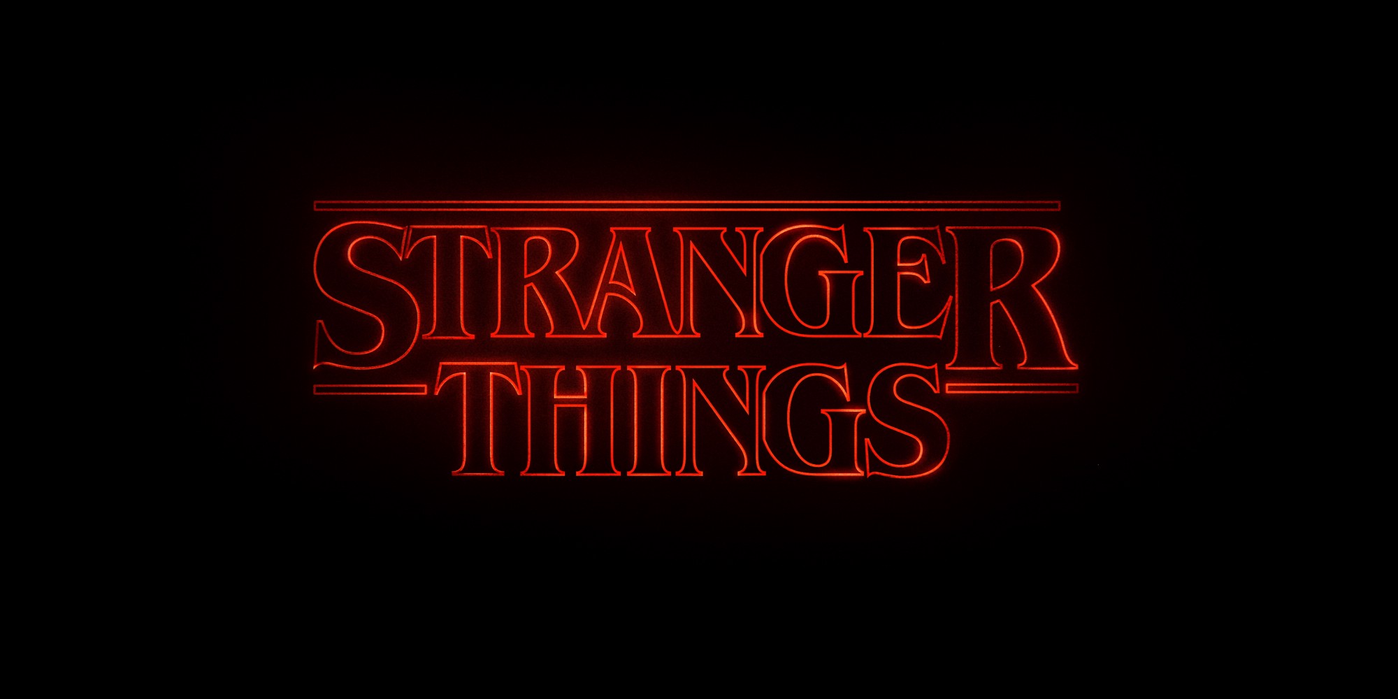
Stranger Things is a new hit Netflix show about supernatural goings-on in the mid-1980s. Part of its magic is the excellent production design: it doesn't just nail the 80s, but it nails the poor midwestern 80s rather than the usual Hollywood middle-class city/coastal/bible-belt 80s. It still feels a bit like the late 70s—not because of 19A0s consumer witchcraft stuff, but because it's the middle of Indiana and most everything's at least 5 years old. Even the typography is perfect, from the very first second.
The Stranger Things title sequence is pure, unadulterated typographic porn. With television shows opting for more elaborate title sequences (think GOT and True Detective), the opening of Stranger Things is refreshingly simple. It trims the fat and shows only what is necessary to set the mood. More importantly, it proves a lesson Ive learned time and time again as a designer: you can do a lot with type.But how do a few pans of a logo accomplish so much in such a short amount of time? I break down its typographic success to three powerful plays: recognition, scale and palette.
Previously: Superrcut of 80s references in Strange Things
Original Link: http://feeds.boingboing.net/~r/boingboing/iBag/~3/aHBZF67OOec/the-typography-of-stranger-thi.html
