
An Interest In:
Web News this Week
- April 20, 2024
- April 19, 2024
- April 18, 2024
- April 17, 2024
- April 16, 2024
- April 15, 2024
- April 14, 2024
Some of Our Sources
- The Logo Smith
- TutsPlus - Design
- Vandelay Design
- Web Designer Depot
- Naldz Graphics
- Web Design Ledger
- CSS Tricks
- Android Dissected
- Codrops
- Daily Now
Help Webnuz
Referal links:
Ridiculously detailed typographical analysis of Blade Runner
![]()
If you love Ridley Scott's sci-fi masterpiece, Blade Runner, the minutia of film, and nerding out over typography, prepare to have your neck bolts blown. Dave Addey runs Typeset in the Future, a website dedicated to the typographic elements found in sci-fi films. He has previously examined the titling, signage, logotypes, text messaging, and visual displays found in 2001: A Space Odyssey, Moon, and Alien. Here, he turns his typographical attentions to Ridley Scott's 1982 sci-fi classic, Blade Runner.
In 5,000 words and hundreds of screen caps, Dave goes through every scrap of textual content seen in the film. What's equally amazing to the point of the piece-- typographic analysis--is how much you learn about every other aspect of the film. This one narrow skew of the movie reveals so many other angles and tangents. Blade Runner is a film I already know too much about and I still learned so much more and had numerous "ah-ha" moments.
The first time we meet Deckard, hes sat in the Los Angeles rain, idly reading a newspaper. The headline of this newspaper is FARMING THE OCEANS, THE MOON AND ANTARCTICA, in what looks like Futura Demi:Heres a close-up shot of that newspaper prop, from an on-set photo of Harrison Ford and Ridley Scott:
The subtitle reads WORLD WIDE COMPUTER LINKUP PLANNED, in what looks like Optima Bold. While the idea of a World Wide Computer Linkup might seem pass as we approach 2019, it was still very much unusual in 1982 when Blade Runner was released. Indeed, it wasnt until March 1982 that the US Department of Defense, creators of pre-Internet network ARPANET, declared TCP/IP as the standard for all military computer networking, pretty much kick-starting what we know as the modern-day Internet of 2016.
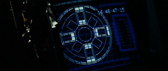
The Spinners landscape-orientation TV shows a display that may be familiar to regular TITF readers:This ENVIRON CTR PURGE display is identical to the one we saw in Alien, just before the Nostromo exploded:
As if that wasnt enough self-plagiarism, Ridley Scott also steals a second display from his earlier sci-fi masterpiece:
which the more observant of you may recognize as Aliens shuttle disconnect sequence:
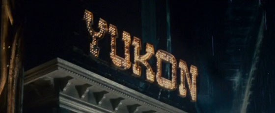
Gaffs Spinner journey also introduces us to a recurring piece of typography from the movies backdrop. The Blade Runner production team re-used city background scenery in different configurations throughout the movie, which is why the glowing NUYOK sign seen hereThere is so much wonderful content here, so many things to tickle a typography and film fan's fancy, I could go on and on. But just go to the site and see it all for yourself. Just don't expect to get anything else done for the next few hours.is remarkably similar to the glowing sign for the YUKON hotel seen thirteen minutes later (also known as the temporary home of replicants Leon and Zhora):
Original Link: http://feeds.boingboing.net/~r/boingboing/iBag/~3/RHLdOjfTH58/ridiculously-detailed-typograp.html
