
An Interest In:
Web News this Week
- April 25, 2024
- April 24, 2024
- April 23, 2024
- April 22, 2024
- April 21, 2024
- April 20, 2024
- April 19, 2024
Some of Our Sources
- TutsPlus - Code
- Pearsonified
- Six Revisions
- Noupe
- Crazy Leaf Design
- My Ink Blog
- Freelance Switch
- Android Headlines
- Daily Now
- Dev To
Help Webnuz
Referal links:
Being Responsive to the Small Things
Jonathan Snook considers the problem of container (or element) queries in the context of responsive web design and looks at the approach taken by current open source JavaScript solutions. Remember, no matter what size of box your Christmas gift comes in, its the thought that counts.
Its that time of the year again to trim the tree with decorations. Or maybe a DOM tree?
Any web page is made of HTML elements that lay themselves out in a tree structure. We start at the top and then have multiple branches with branches that branch out from there.

To decorate our tree, we use CSS to specify which branches should receive the tinsel we wish to adorn upon it. Its all so lovely.
In years past, this was rather straightforward. But these days, our trees need to be versatile. They need to be responsive!
Responsive web design is pretty wonderful, isnt it? Based on our viewport, we can decide how elements on the page should change their appearance to accommodate various constraints using media queries.

Alas, its not all sunshine, lollipops, and rainbows.
With complex layouts, we may have design chunks lets call them components that appear in different contexts. Each context may end up providing its own constraints on the design, both in its default state and in its possibly various responsive states.
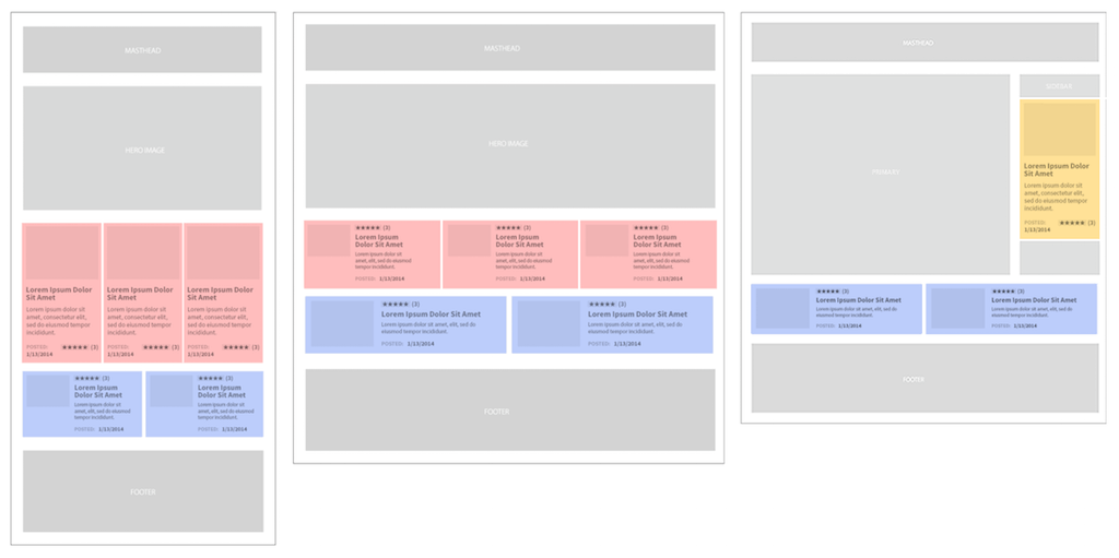
Media queries, however, limit us to the context of the entire viewport, not individual containers on the page. For every container our component lives in, we need to specify how to rearrange things in that context. The more complex the system, the more contexts we need to write code for.
@media (min-width: 800px) { .features > .component { } .sidebar > .component {} .grid > .component {}}Each new component and each new breakpoint just makes the entire system that much more difficult to maintain.
@media (min-width: 600px) { .features > .component { } .grid > .component {}}@media (min-width: 800px) { .features > .component { } .sidebar > .component {} .grid > .component {}}@media (min-width: 1024px) { .features > .component { }}Enter container queries
Container queries, also known as element queries, allow you to specify conditional CSS based on the width (or maybe height) of the container that an element lives in. In doing so, you no longer have to consider the entire page and the interplay of all the elements within.
With container queries, youll be able to consider the breakpoints of just the component youre designing. As a result, you end up specifying less code and the components you develop have fewer dependencies on the things around them. (I guess that makes your components more independent.)
Awesome, right?
Theres only one catch.
Browsers cant do container queries. Theres not even an official specification for them yet. The Responsive Issues (ne Images) Community Group is looking into solving how such a thing would actually work.
See, container queries are tricky from an implementation perspective. The contents of a container can affect the size of the container. Because of this, you end up with troublesome circular references.
For example, if the width of the container is under 500px then the width of the child element should be 600px, and if the width of the container is over 500px then the width of the child element should be 400px.
Can you see the dilemma? When the container is under 500px, the child element resizes to 600px and suddenly the container is 600px. If the container is 600px, then the child element is 400px! And so on, forever. This is bad.
I guess we should all just go home and sulk about how we just got a pile of socks when we really wanted the Millennium Falcon.
Our saviour this Christmas: JavaScript
The three wise men Tim Berners-Lee, Hkon Wium Lie, and Brendan Eich brought us the gifts of HTML, CSS, and JavaScript.
To date, there are a handful of open source solutions to fill the gap until a browser implementation sees the light of day.
- Elementary by Scott Jehl
- ElementQuery by Tyson Matanich
- EQ.js by Sam Richards
- CSS Element Queries from Marcj
Using any of these can sometimes feel like your toy broke within ten minutes of unwrapping it.
Each take their own approach on how to specify the query conditions. For example, Elementary, the smallest of the group, only supports min-width declarations made in a :before selector.
.mod-foo:before { content: 300 410 500;}The script loops through all the elements that you specify, reading the content property and then setting an attribute value on the HTML element, allowing you to use CSS to style that condition.
.mod-foo[data-minwidth~="300"] { background: blue;}To get the script to run, youll need to set up event handlers for when the page loads and for when it resizes.
window.addEventListener( "load", window.elementary, false );window.addEventListener( "resize", window.elementary, false );This works okay for static sites but breaks down on pages where elements can expand or contract, or where new content is dynamically inserted.
In the case of EQ.js, the implementation requires the creation of the breakpoints in the HTML. That means that you have implementation details in HTML, JavaScript, and CSS. (Although, with the JavaScript, once its in the build system, it shouldnt ever be much of a concern unless youre tracking down a bug.)
Another problem you may run into is the use of content delivery networks (CDNs) or cross-origin security issues. The ElementQuery and CSS Element Queries libraries need to be able to read the CSS file. If you are unable to set up proper cross-origin resource sharing (CORS) headers, these libraries wont help.
At Shopify, for example, we had all of these problems. The admin that store owners use is very dynamic and the CSS and JavaScript were being loaded from a CDN that prevented the JavaScript from reading the CSS.
To go responsive, the team built their own solution one similar to the other scripts above, in that it loops through elements and adds or removes classes (instead of data attributes) based on minimum or maximum width.
The caveat to this particular approach is that the declaration of breakpoints had to be done in JavaScript.
elements = [ { module: .carousel, className:alpha, minWidth: 768, maxWidth: 1024 }, { module: .button, className:beta, minWidth: 768, maxWidth: 1024 } , { module: .grid, className:cappa, minWidth: 768, maxWidth: 1024 } ]With that done, the script then had to be set to run during various events such as inserting new content via Ajax calls. This sometimes reveals itself in flashes of unstyled breakpoints (FOUB). An unfortunate side effect but one largely imperceptible.
Using this approach, however, allowed the Shopify team to make the admin responsive really quickly. Each member of the team was able to tackle the responsive story for a particular component without much concern for how all the other components would react.
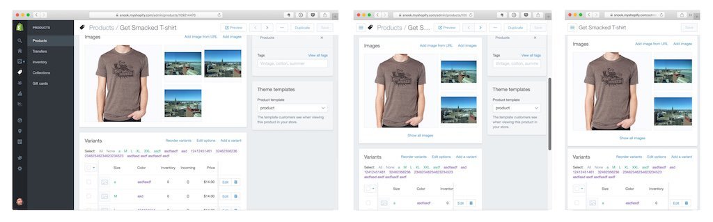
Each element responds to its own breakpoint that would amount to dozens of breakpoints using traditional breakpoints. This approach allows for a truly fluid and adaptive interface for all screens.
Christmas is over
I wish I were the bearer of greater tidings and cheer. Its not all bad, though. We may one day see browsers implement container queries natively. At which point, we shall all rejoice!
About the author
Jonathan Snook writes about tips, tricks, and bookmarks on his blog at Snook.ca. He has also written for A List Apart and .net magazine, and has co-authored two books, The Art and Science of CSS and Accelerated DOM Scripting. He has also authored and received world-wide acclaim for the self-published book, Scalable and Modular Architecture for CSS sharing his experience and best practices on CSS architecture.
Photo: Patrick H. Lauke
Original Link: http://feedproxy.google.com/~r/24ways/~3/tpf5UzY16j0/
24 Ways
 # 24 ways is an edgeofmyseat.com production. # Edited by Drew McLellan and Brian Suda. # Assisted by Anna Debenham and Owen Gregory.
More About this Source Visit 24 Ways