
An Interest In:
Web News this Week
- April 12, 2024
- April 11, 2024
- April 10, 2024
- April 9, 2024
- April 8, 2024
- April 7, 2024
- April 6, 2024
Some of Our Sources
- Slashdot
- Vandelay Design
- FanExtra - PSD
- Specky Boy
- CSS Tricks
- Web Resource Source
- Android Dissected
- Android Headlines
- Daily Now
- TechPowerUp
Help Webnuz
Referal links:
Putting My Patterns through Their Paces
Ethan Marcotte dashes through the wintry landscape, his sled of flexboxed content drawn faithfully by a team of well-ordered hierarchical HTML huskies. For when it comes to structure and presentation, we must take care not to put the sleigh before the hounds.
Over the last few years, the conversation around responsive design has shifted subtly, focusing not on designing pages, but on patterns: understanding the small, reusable elements that comprise a larger design system. And given that many of those patterns are themselves responsive, learning to manage these small layout systems has become a big part of my work.
The thing is, the more pattern-driven work I do, the more I realize my design process has changed in a number of subtle, important ways. I suppose you might even say that pattern-driven design has, in a few ways, redesigned me.
Meet the Teaser
Heres a recent example. A few months ago, some friends and I redesigned The Toast. (It was a really, really fun project, and we learned a lot.) Each page of the site is, as you might guess, stitched together from a host of tiny, reusable patterns. Some of them, like the search form and footer, are fairly unique, and used once per page; others are used more liberally, and built for reuse. The most prevalent example of these more generic patterns is the teaser, which is classed as, uh, .teaser. (Look, I never said I was especially clever.)
In its simplest form, a teaser contains a headline, which links to an article:

Fairly straightforward, sure. But its just the foundation: from there, teasers can have a byline, a description, a thumbnail, and a comment count. In other words, we have a basic building block (.teaser) that contains a few discrete content types some required, some not. In fact, very few of those pieces need to be present; to qualify as a teaser, all we really need is a link and a headline. But by adding more elements, we can build slight variations of our teaser, and make it much, much more versatile.
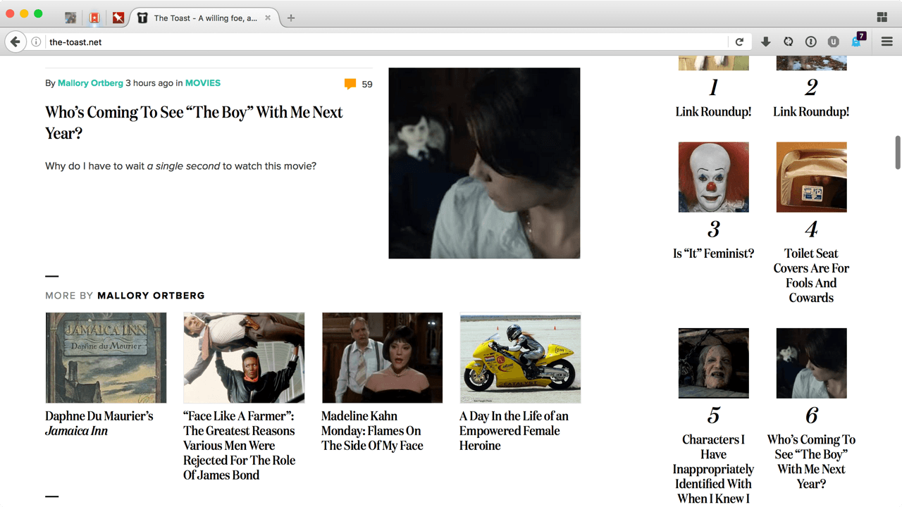
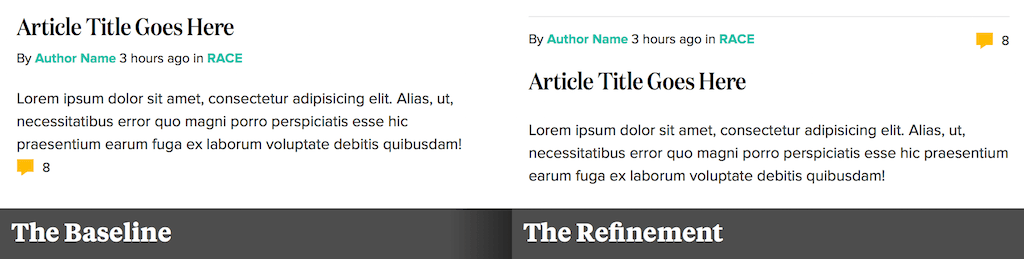
But the teaser variation Id like to call out is the one that appears on The Toasts homepage, on search results or on section fronts. In the main content area, each teaser in the list features larger images, as well as an interesting visual treatment: the byline and comment count were the most prominent elements within each teaser, appearing above the headline.
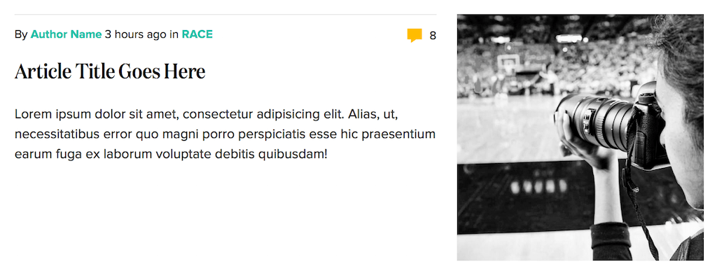
And this is, as it happens, the teaser variation that gave me pause. Back in the old days you know, like six months ago I probably wouldve marked this module up to match the design. In other words, I wouldve looked at the modules visual hierarchy (metadata up top, headline and content below) and written the following HTML:
<div class="teaser"> <p class="article-byline">By <a href="#">Author Name</a></p> <a class="comment-count" href="#">126 <i>comments</i></a> <h1 class="article-title"><a href="#">Article Title</a></h1> <p class="teaser-excerpt">Lorem ipsum dolor sit amet, consectetur</p></div>But then I caught myself, and realized this wasnt the best approach.
Moving Beyond Layout
Since Ive started working responsively, theres a question I work into every step of my design process. Whether Im working in Sketch, CSSing a thing, or researching a project, I try to constantly ask myself:
What if someone doesnt browse the web like I do?
Okay, that doesnt seem especially fancy. (And maybe you came here for fancy.) But as straightforward as that question might seem, its been invaluable to so many aspects of my practice. If Im working on a widescreen layout, that question helps me remember the constraints of the small screen; if Im working on an interface that has some enhancements for touch, it helps me consider other input modes as I work. Its also helpful as a reminder that many might not see the screen the same way I do, and that accessibility (in all its forms) should be a throughline for our work on the web.
And that last point, thankfully, was what caught me here. While having the byline and comment count at the top was a lovely visual treatment, it made for a terrible content hierarchy. For example, itd be a little weird if the page was being read aloud in a speaking browser: the name of the author and the number of comments would be read aloud before the title of the article with which theyre associated.
Thats why I find its helpful to begin designing a patterns hierarchy before its layout: to move past the visual presentation in front of me, and focus on the underlying content Im trying to support. In other words, if someones encountering my design without the CSS Ive written, what should their experience be?
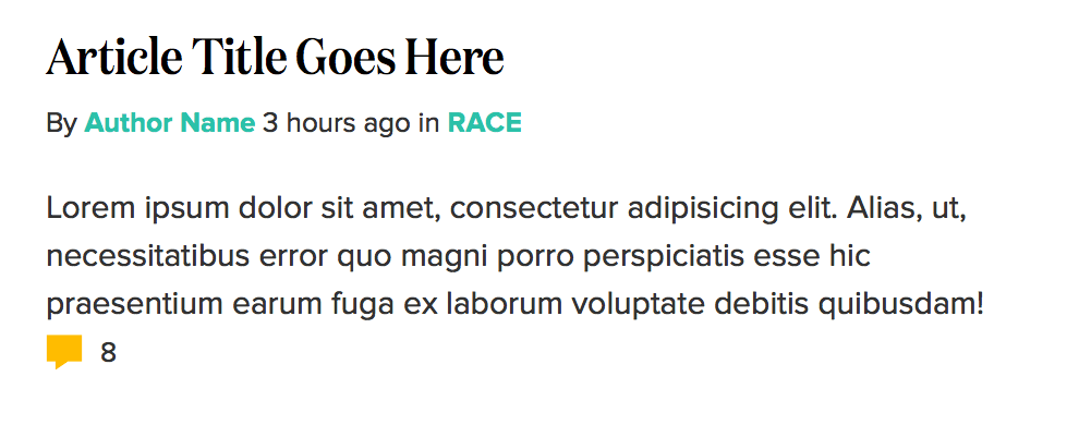
So I took a step back, and came up with a different approach:
<div class="teaser"> <h1 class="article-title"><a href="#">Article Title</a></h1> <h2 class="article-byline">By <a href="#">Author Name</a></h2> <p class="teaser-excerpt"> Lorem ipsum dolor sit amet, consectetur <a class="comment-count" href="#">126 <i>comments</i></a> </p></div>Much, much better. This felt like a better match for the content I was designing: the headline easily most important element was at the top, followed by the authors name and an excerpt. And while the comment count is visually the most prominent element in the teaser, I decided it was hierarchically the least critical: thats why its at the very end of the excerpt, the last element within our teaser. And with some light styling, weve got a respectable-looking hierarchy in place:
Yeah, youre right its not our final design. But from this basic-looking foundation, we can layer on a bit more complexity. First, well bolster the markup with an extra element around our title and byline:
<div class="teaser"> <div class="teaser-hed"> <h1 class="article-title"><a href="#">Article Title</a></h1> <h2 class="article-byline">By <a href="#">Author Name</a></h2> </div> </div>With that in place, we can use flexbox to tweak our layout, like so:
.teaser-hed { display: flex; flex-direction: column-reverse;}flex-direction: column-reverse acts a bit like a change in gravity within our teaser-hed element, vertically swapping its two children.
Getting closer! But as great as flexbox is, it doesnt do anything for elements outside our container, like our little comment count, which is, as youve probably noticed, still stranded at the very bottom of our teaser.
Flexbox is, as you might already know, wonderful! And while it enjoys incredibly broad support, there are enough implementations of old versions of Flexbox (in addition to plenty of bugs) that I tend to use a feature test to check if the browsers using a sufficiently modern version of flexbox. Heres the one we used:
var doc = document.body || document.documentElement;var style = doc.style;if ( style.webkitFlexWrap == '' || style.msFlexWrap == '' || style.flexWrap == '' ) { doc.className += " supports-flex";}Eagle-eyed readers will note we could have used @supports feature queries to ask browsers if they support certain CSS properties, removing the JavaScript dependency. But since we wanted to serve the layout to IE we opted to write a little question in JavaScript, asking the browser if it supports flex-wrap, a property used elsewhere in the design. If the browser passes the test, then a class of supports-flex gets applied to our html element. And with that class in place, we can safely quarantine our flexbox-enabled layout from less-capable browsers, and finish our teasers design:
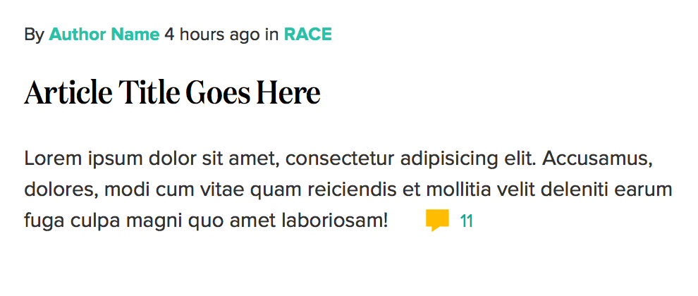
.supports-flex .teaser-hed { display: flex; flex-direction: column-reverse;}.supports-flex .teaser .comment-count { position: absolute; right: 0; top: 1.1em;}If the supports-flex class is present, we can apply our flexbox layout to the title area, sure but we can also safely use absolute positioning to pull our comment count out of its default position, and anchor it to the top right of our teaser. In other words, the browsers that dont meet our threshold for our advanced styles are left with an attractive design that matches our HTMLs content hierarchy; but the ones that pass our test receive the finished, final design.
And with that, our teasers complete.
Diving Into Device-Agnostic Design
This is, admittedly, a pretty modest application of flexbox. (For some truly next-level work, Id recommend Heydon Pickerings Flexbox Grid Finesse, or anything Zoe Mickley Gillenwater publishes.) And for such a simple module, you might feel like this is, well, quite a bit of work. And youd be right! In fact, its not one layout, but two: a lightly styled content hierarchy served to everyone, with the finished design served conditionally to the browsers that can successfully implement it. But Ive found that thinking about my design as existing in broad experience tiers in layers is one of the best ways of designing for the modern web. And whats more, it works not just for simple modules like our teaser, but for more complex or interactive patterns as well.
This more layered approach to interface design isnt a new one, mind you: its been championed by everyone from Filament Group to the BBC. And with all the challenges we keep uncovering, a more device-agnostic approach is one of the best ways Ive found to practice responsive design. As Trent Walton once wrote,
Like cars designed to perform in extreme heat or on icy roads, websites should be built to face the reality of the webs inherent variability.
We have a weird job, working on the web. Were designing for the latest mobile devices, sure, but were increasingly aware that our definition of smartphone is much too narrow. Browsers have started appearing on our wrists and in our cars dashboards, but much of the worlds mobile data flows over sub-3G networks. After all, the webs evolution has never been charted along a straight line: its simultaneously getting slower and faster, with devices new and old coming online every day. With all the challenges in front of us, including many we dont yet know about, a more device-agnostic, more layered design process can better prepare our patterns and ourselves for the future.
(It wont help you get enough to eat at holiday parties, though.)
About the author
Ethan Marcotte is an independent designer and developer, and the fellow who coined the term responsive web design. He is the author of two books on the topic, Responsive Web Design and Responsive Design: Patterns and Principles, and has been known to give a conference talk or two. Ethan is passionate about digital design, emerging markets, and ensuring global access, and has been known to link to the odd GIF now and again.
Original Link: http://feedproxy.google.com/~r/24ways/~3/ImilM2JLtGU/
24 Ways
 # 24 ways is an edgeofmyseat.com production. # Edited by Drew McLellan and Brian Suda. # Assisted by Anna Debenham and Owen Gregory.
More About this Source Visit 24 Ways