
An Interest In:
Web News this Week
- April 19, 2024
- April 18, 2024
- April 17, 2024
- April 16, 2024
- April 15, 2024
- April 14, 2024
- April 13, 2024
Some of Our Sources
- Slashdot
- Technology Review
- Just Creative
- Six Revisions
- TutsPlus - Design
- You The Designer
- Reencoded
- CSS Globe
- Design Modo
- Hashedout
Help Webnuz
Referal links:
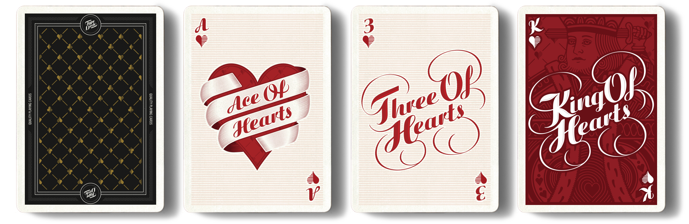
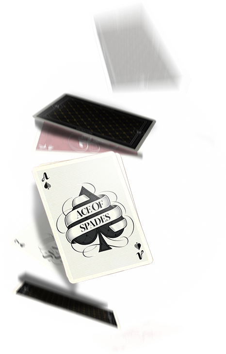
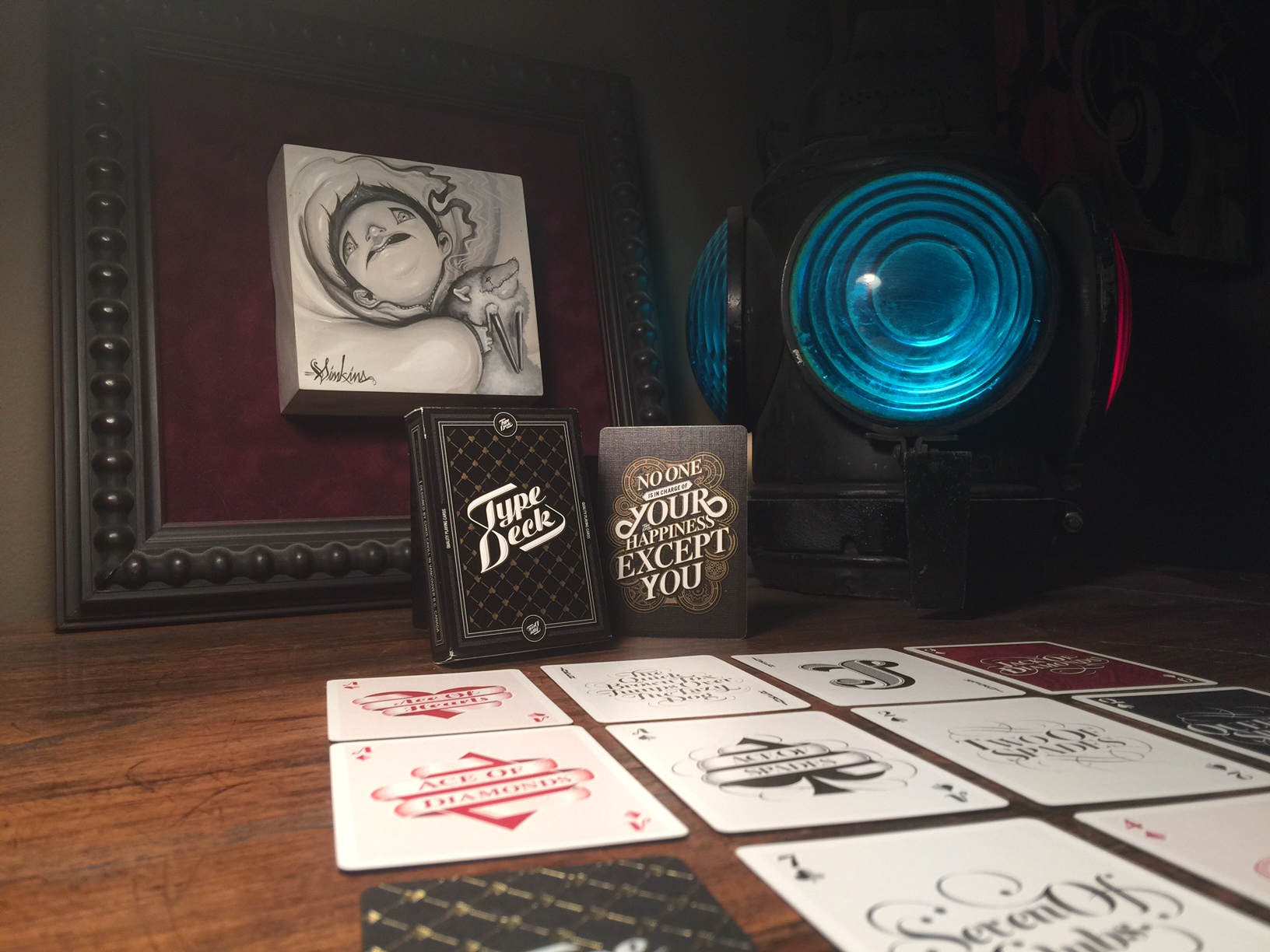
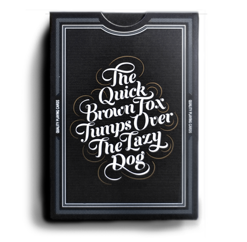
The Type Deck: playing cards with beautiful fonts
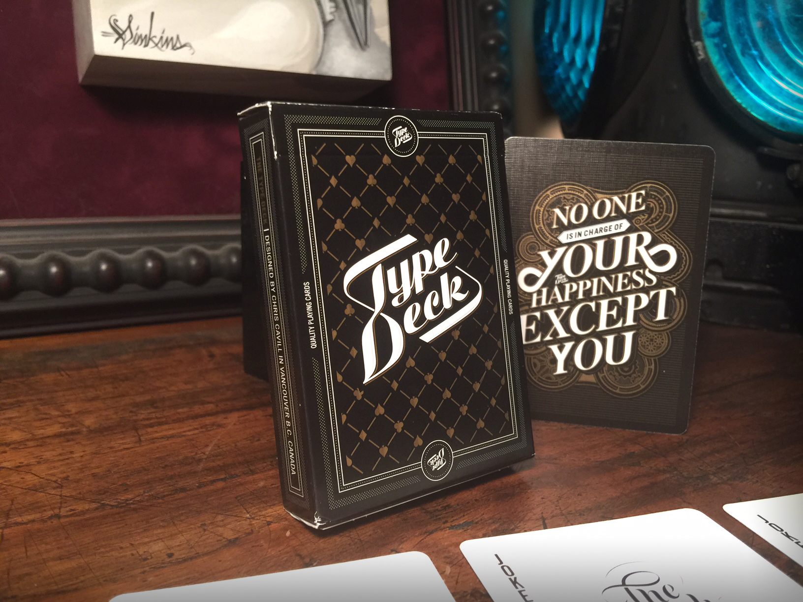
I love marveling at good type design because I know how much effort it takes to make things look just right.
To me, theres no deck of playing cards that uses intertwining fonts better than the Type Deck. It took designer Chris Cavill over 5 months to get this project off the ground and I think it was worth the effort.
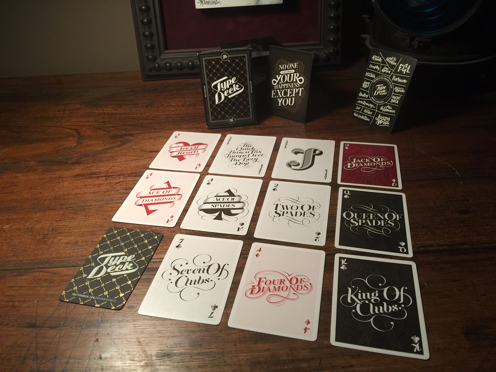
Each suit of the deck has been uniquely handled, while maintaining a cohesive style throughout.
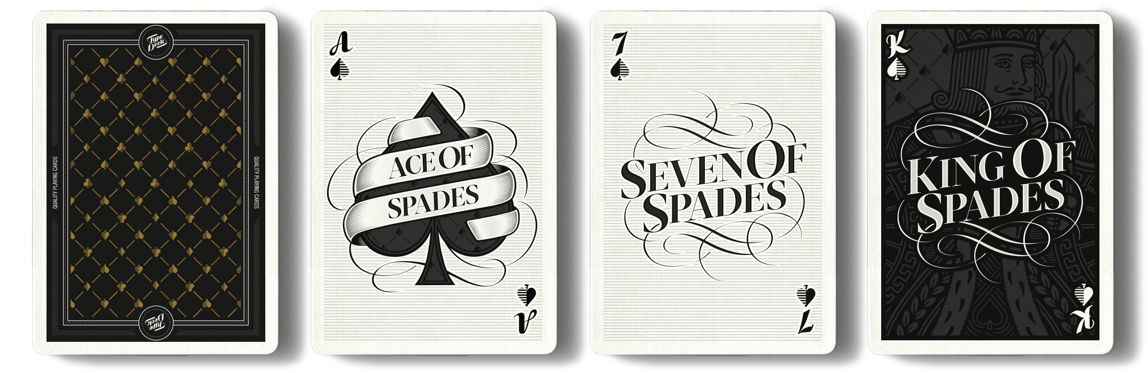
Usually, the lions share of time and effort in a deck of cards is given to the court cards. But not in the Type Deck.
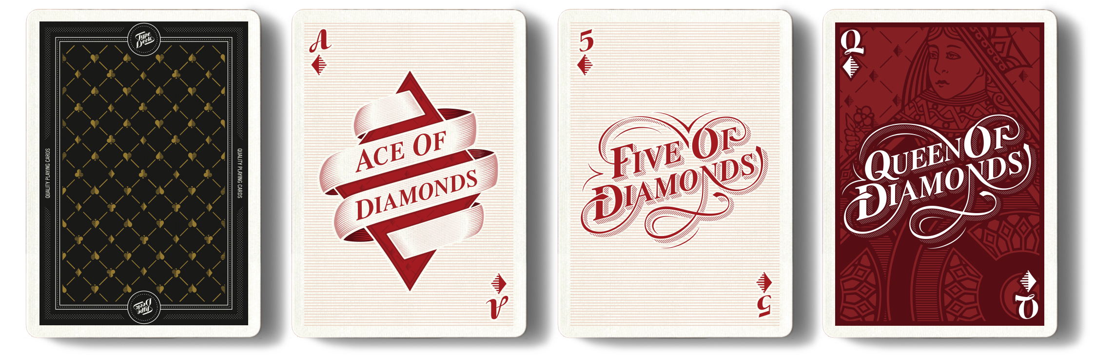
Though the illustrations of the royal cards are crisp and beautiful
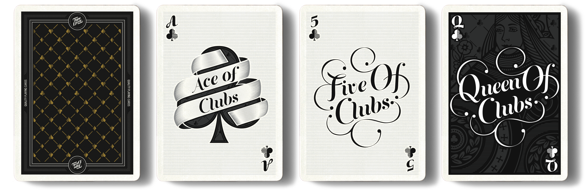
They are pushed back and subdued to let the typography be the star.
No matter what Chris says, these cards were never meant to be played with. They were meant to be studied.
And when I grow up as a graphic designer I hope to create something that hits typographic nerves like this deck does.
But for now - I'll just have to be content with what I have.
Original Link: http://feeds.boingboing.net/~r/boingboing/iBag/~3/oYZH-K-xIOI/the-type-deck-playing-cards-w.html
