
Some of Our Sources
- Just Creative
- Smashing Magazine
- You The Designer
- Creative Curio
- Web Designer Depot
- Noupe
- Fudge Graphics
- Freelance Switch
- Codrops
- The Verge
Help Webnuz
Referal links:
November 21, 2013 01:30 am GMT
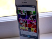 Today, Tumblr is releasing its redesigned client for iPhone and iPad, bringing along a completely refreshed look and feel for iOS 7. The redesign, unlike some others to come out of Apple’s big shakeup, manages to maintain the core of what makes Tumblr so attractive to its millions of users. The new Tumblr app will look fairly familiar to users, as the trademark blue remains, as does the post format that puts the focus on the content being shared, with a slim bar of interface hovering behind, helpful but not intrusive. What’s gained this time is a big focus on the Activity stream, which was previously buried underneath the account tab. Moving the Activity stream out to the tabs, says Tumblr’s Creative Director Peter Vidani, was a decision that was made simply because it was so popular. Users, especially heavy users, were checking it a lot to see the latest likes, replies, reblogs and follows incessantly. Moving that out to the tab bar is a statement about how important this stream is. It’s the feedback loop, the thing that keeps you coming back to the app obsessively, just to see if you’ve got some new interactions to check out. The same concept drives feeds in other apps like Twitter’s Connect tab. If you’re getting feedback, you’re going to keep producing content (or re-blogging it) to get more. Call it Pavlovian, but it makes a lot of sense. In addition to the Activity stream’s promotion, posting has also gotten a complete revamp. Tapping the new post icon gives you access to six large and easier to tap icons for all of the content types. Each of the composition screens has also gotten a revamp, but the photo sharing option is probably the most different. The photo capture screen is really cleverly done, and now dumps you onto a grid of images from your camera roll, rather than allowing you to choose immediately between the roll and the camera. This, Vidani says, was done after the data suggested that people dipped into their albums for images to post far more than they went to the camera. But the camera experience isn’t neglected there’s a square near the bottom with a camera icon that displays a live view of your phone’s camera, inviting you to shoot an image if you choose. It’s neatly done. Nicely detailed touches are scattered throughout. There are
Original Link: http://feedproxy.google.com/~r/Techcrunch/~3/jKrWnzf16n8/
Tumblr for iOS 7 Sharpens A Great Design Without Diluting It, And Brings Focus Onto Activity Stream
Today, Tumblr is releasing its redesigned client for iPhone and iPad, bringing along a completely refreshed look and feel for iOS 7. The redesign, unlike some others to come out of Apple’s big shakeup, manages to maintain the core of what makes Tumblr so attractive to its millions of users. The new Tumblr app will look fairly familiar to users, as the trademark blue remains, as does the post format that puts the focus on the content being shared, with a slim bar of interface hovering behind, helpful but not intrusive. What’s gained this time is a big focus on the Activity stream, which was previously buried underneath the account tab. Moving the Activity stream out to the tabs, says Tumblr’s Creative Director Peter Vidani, was a decision that was made simply because it was so popular. Users, especially heavy users, were checking it a lot to see the latest likes, replies, reblogs and follows incessantly. Moving that out to the tab bar is a statement about how important this stream is. It’s the feedback loop, the thing that keeps you coming back to the app obsessively, just to see if you’ve got some new interactions to check out. The same concept drives feeds in other apps like Twitter’s Connect tab. If you’re getting feedback, you’re going to keep producing content (or re-blogging it) to get more. Call it Pavlovian, but it makes a lot of sense. In addition to the Activity stream’s promotion, posting has also gotten a complete revamp. Tapping the new post icon gives you access to six large and easier to tap icons for all of the content types. Each of the composition screens has also gotten a revamp, but the photo sharing option is probably the most different. The photo capture screen is really cleverly done, and now dumps you onto a grid of images from your camera roll, rather than allowing you to choose immediately between the roll and the camera. This, Vidani says, was done after the data suggested that people dipped into their albums for images to post far more than they went to the camera. But the camera experience isn’t neglected there’s a square near the bottom with a camera icon that displays a live view of your phone’s camera, inviting you to shoot an image if you choose. It’s neatly done. Nicely detailed touches are scattered throughout. There areOriginal Link: http://feedproxy.google.com/~r/Techcrunch/~3/jKrWnzf16n8/
Share this article:
Tweet

View Full Article
Techcrunch
 TechCrunch is a leading technology blog, dedicated to obsessively profiling startups, reviewing new Internet products, and breaking tech news.
More About this Source Visit Techcrunch