
An Interest In:
Web News this Week
- March 28, 2024
- March 27, 2024
- March 26, 2024
- March 25, 2024
- March 24, 2024
- March 23, 2024
- March 22, 2024
Some of Our Sources
- Team Treehouse
- Just Creative
- Abduzeedo
- Noupe
- CSS Globe
- Stylized Web
- Spyre Studios
- Design Modo
- Codrops
- Hashedout
Help Webnuz
Referal links:
April 23, 2013 08:00 pm GMT
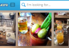 Foursquare recently raised another round of funding, with the announcement coming just a few days after it released its latest iOS app redesign. Today, the company has launched redesigned venue pages, to fit in with what they did last year on the web with its homepage, focusing on explore and discover functionality. The changes are to capitalize on the traffic that Foursquare gets from its now #1 referrer on the web, Google, which traffic has doubled from over the past year. This is an important play for Foursquare, as its competing with Google’s own Local product, Yelp….and it seems like Facebook too, after its redesign today for local business pages. Foursquare’s lead engineer for the web, Mike Singleton, told me that the site now gets over 50M unique visitors on the web, which is 17M more than actually use its app. That means that Foursquare is quietly breaking through as a place for information about venues, its most prized asset: People are coming from Google for different reasons, we needed to give them the information they needed at a glance, which was difficult. Since focusing on its Explore functionality, Singleton says that its usage has doubled, especially on the website. The new venue page has all of the information that people need in a quick glance, the pages are more visually appealing and owners of the venues should be proud to show them off, perhaps by linking to them on their website over competitors like Yelp. Here’s a look at what a venue page looked like before today’s launch: You’ll notice that some of the more attractive content, such as photos, are pushed way down, giving more focus to the map. Additionally, information like when the venue is open was shoved to the right-hand side, requiring a scroll, as well as the someone’s eyes actually finding them. This redesign solves that: The new design is cleaner, and brings all of the information that Google searchers would want to see immediately, such as photos of the venue and a way more attractive map. Since some of the people visiting from the web might not be app users, Foursquare wants to give them a better first impression of the service, by populating the page with the info that’s needed to make quick decisions, like whether to actually go to a place for dinner or not. By being able to search through tips,
Original Link: http://feedproxy.google.com/~r/Techcrunch/~3/eKHDLnZcK1o/
Foursquare Redesigns Its Venue Pages For The Web To Capitalize On Its 50M Monthly Unique Visitors
Foursquare recently raised another round of funding, with the announcement coming just a few days after it released its latest iOS app redesign. Today, the company has launched redesigned venue pages, to fit in with what they did last year on the web with its homepage, focusing on explore and discover functionality. The changes are to capitalize on the traffic that Foursquare gets from its now #1 referrer on the web, Google, which traffic has doubled from over the past year. This is an important play for Foursquare, as its competing with Google’s own Local product, Yelp….and it seems like Facebook too, after its redesign today for local business pages. Foursquare’s lead engineer for the web, Mike Singleton, told me that the site now gets over 50M unique visitors on the web, which is 17M more than actually use its app. That means that Foursquare is quietly breaking through as a place for information about venues, its most prized asset: People are coming from Google for different reasons, we needed to give them the information they needed at a glance, which was difficult. Since focusing on its Explore functionality, Singleton says that its usage has doubled, especially on the website. The new venue page has all of the information that people need in a quick glance, the pages are more visually appealing and owners of the venues should be proud to show them off, perhaps by linking to them on their website over competitors like Yelp. Here’s a look at what a venue page looked like before today’s launch: You’ll notice that some of the more attractive content, such as photos, are pushed way down, giving more focus to the map. Additionally, information like when the venue is open was shoved to the right-hand side, requiring a scroll, as well as the someone’s eyes actually finding them. This redesign solves that: The new design is cleaner, and brings all of the information that Google searchers would want to see immediately, such as photos of the venue and a way more attractive map. Since some of the people visiting from the web might not be app users, Foursquare wants to give them a better first impression of the service, by populating the page with the info that’s needed to make quick decisions, like whether to actually go to a place for dinner or not. By being able to search through tips,Original Link: http://feedproxy.google.com/~r/Techcrunch/~3/eKHDLnZcK1o/
Share this article:
Tweet

View Full Article
Techcrunch
 TechCrunch is a leading technology blog, dedicated to obsessively profiling startups, reviewing new Internet products, and breaking tech news.
More About this Source Visit Techcrunch