
An Interest In:
Web News this Week
- March 27, 2024
- March 26, 2024
- March 25, 2024
- March 24, 2024
- March 23, 2024
- March 22, 2024
- March 21, 2024
Some of Our Sources
- Smashing Magazine
- Six Revisions
- Creative Curio
- Inspiredology
- Web Designer Depot
- Naldz Graphics
- My Ink Blog
- Web Design Ledger
- Spyre Studios
- The Verge
Help Webnuz
Referal links:
Say Hello to Webkit Filters
Earlier this month, a new specification, Filter Effects 1.0, was released. It presents some exciting new Photoshop-like effects that we can use in the browser! Even better, Webkit has already landed support (in the nightlies)!
According to the Spec…
“A filter effect is a graphical operation that is applied to an element as it is drawn into the document. It is an image-based effect, in that it takes zero or more images as input, a number of parameters specific to the effect, and then produces an image as output.”
Now, at least at this point, I wouldn’t presume to be able to show you everything that’s possible with these new filters. I’m still learning it myself! That said, I’ll show you a handful of the new filters, how we can use them in our projects, and then, hopefully, we can all brainstorm and learn from each other within the comments. Let’s get started.
Filters are intended to be applied to images. As such, for the handful of demos below, we’ll be using the Nettuts+ logo as input.
Remember: these effects aren’t yet available in the public releases of Webkit browsers. For now, download Canary when testing these demos.
hue-rotate
Ever played around with the Hue/Saturation panel in Photoshop? Well now you can play around with it in the browser.
img { -webkit-filter: hue-rotate(50deg);}If specifying this value in degrees seems confusing, just imagine a color wheel. The number of degrees you specify determines where that wheel stops. This means, that 0deg won’t do a thing, while 50deg will turn the dial, accordingly.
In this case, the Nettuts+ logo will take on a blu-ish hue.

grayscale
We’ve used a variety of hacks in the past to transition an image from black and white to color in the browser. One technique calls for two images stacked on top of one another. Another option is to use canvas. Or… we can use the grayscale filter.
img { -webkit-filter: grayscale(100%);}When applying a percentage to the grayscale function, just think to yourself, “On a scale of 0 to 100%, how gray do I want this image to be?

When used in tandem with CSS3 transition, we can apply a nice and clean hover effect.
img { -webkit-transition: -webkit-filter 1s;}img:hover { -webkit-filter: grayscale(100%);}In the future, you’ll want to provide prefixes for the other browsers, however, it’s not necessary at this point. No need in applying Mozilla transitions to accomodate for a filter that’s only implemented in Webkit (so far).
sepia
Enjoy the sepia-flavored Instagram effect? Let’s see what Nettuts+ looked like in the old west.
img { -webkit-filter: sepia(100%);}
Typically, though, this effect is applied to photos. Let’s see how my favorite artist looks in sepia.
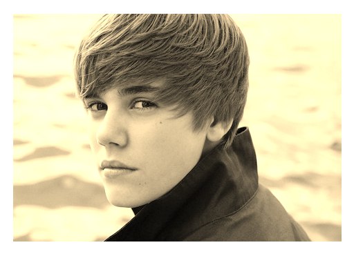
Excellent.
blur
By passing a radius, we can blur an image in the browser with ease.
img { -webkit-filter: blur(2px);}
Or by upping the blur radius to 50px.

brightness
We use the brightness filter to specify…wait for it…how bright the input image should appear.
img { -webkit-filter: brightness(15%);}
Think of 100% as home base. brightness(100%) keeps the image unchanged. As we reduce this percentage, however, the image will continue to darken.
Don’t forget: you can combine all of these filters.
img { -webkit-filter: brightness(60%) sepia(100%);}
contrast
We can now adjust the contrast of an image quite easily.
img { -webkit-filter: contrast(200%);}
Once again, think of 100% as resting position. We can then reduce or increase this value to adjust the contrast of the image. According to the spec, applying a value of 0% should make the image 100% black, similar to what you might expect from -webkit-filter: brightness(0%);. However, I’m seeing more of a dark gray.
img { -webkit-filter: contrast(0%);}
Now if we up the percentage considerably, to 2000%:
img { -webkit-filter: contrast(200%);}
But, strangely, if we cut off the percentage, and apply a value of 20 (which I don’t think we’re supposed to do), we get the exact same result. That’s a bit odd.
img { -webkit-filter: contrast(20);}Just for fun, let’s create a throbbing Matrix version of the Nettuts+ logo. We’ll combine CSS3 animations and filters.
img { -webkit-animation: bluePill 1s alternate infinite;}@-webkit-keyframes bluePill { 0% { -webkit-filter: contrast(2000%); } 100% { -webkit-filter: contrast(100%); }}invert
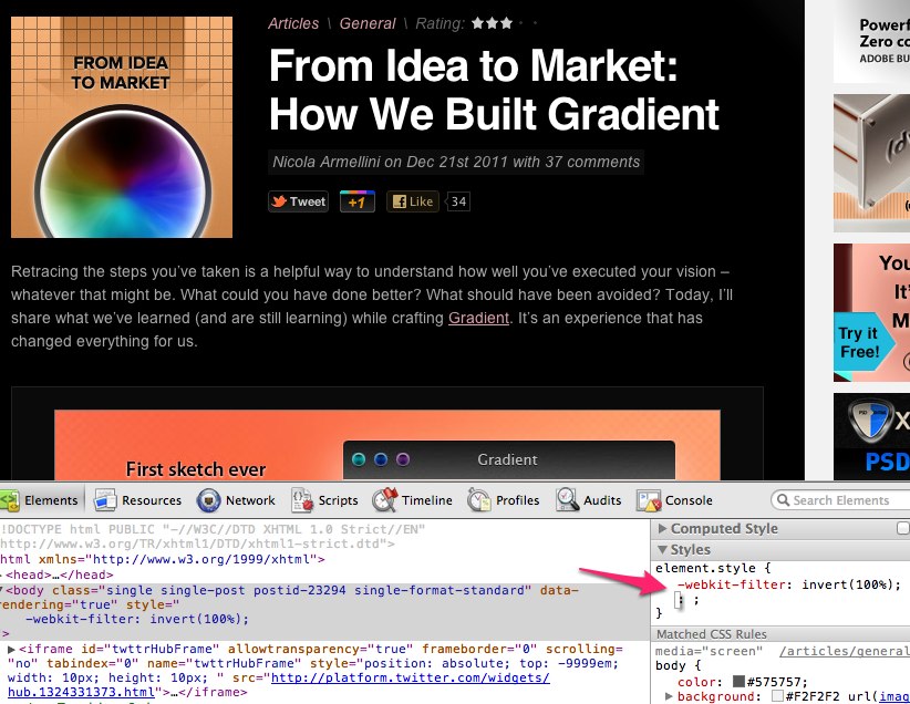
Mac users: press Control + Option + Command + 8. Notice how it inverts your screen (of course you noticed). I use this trick late at night when I’m reading on the computer, but my eyes are sore.
By applying a percentage of 100 to the new invert filter, we can achieve the exact same effect.
img { -webkit-filter: invert(100%);}
Note that 0% will leave the image unchanged.
Now, you could technically apply this to, say, the body of your website, and it would work. However, you’ll notice considerable slow down, and lose the ability to scroll the page. AKA – Don’t do it, except for fun.
saturate
In addition to setting grayscale(100%), we could also achieve a similar effect by desaturating the image entirely.
In this case, 100% is the unchanged state, at which point you can either decrease or increase this value. As such, reducing this value to 0% should remove all color from the image.
img { -webkit-filter: saturate(0%);}
Or, by upping the value to 700%:

That’s All For Now
Stay tuned to this article over the course of the next week. As these techniques are still super new, we all need time to figure out how to use them. I’ll update this article as I learn more!
Original Link: http://feedproxy.google.com/~r/nettuts/~3/Q1m6n7ln_D0/
TutsPlus - Code
 Tuts+ is a site aimed at web developers and designers offering tutorials and articles on technologies, skills and techniques to improve how you design and build websites.
More About this Source Visit TutsPlus - Code